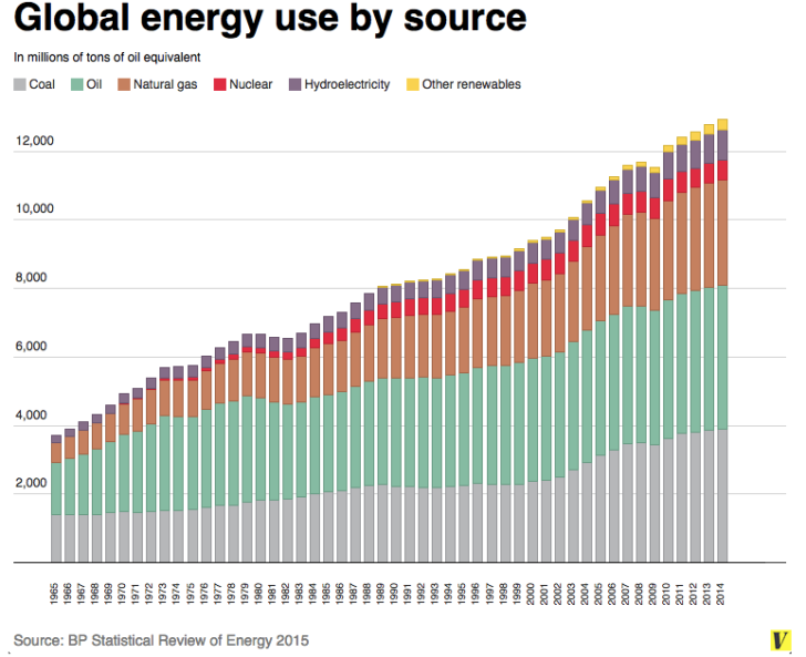
Energy reality in a picture Worth a thousands words… none of them comforting to warmists. From the World Economic Forum: Share this: Email a link to a friend (Opens in new window) Email Print (Opens in new window) Print Share on X (Opens in new window) X Share on Facebook (Opens in new window) Facebook More Share on LinkedIn (Opens in new window) LinkedIn Share on Pinterest (Opens in new window) Pinterest Share on Tumblr (Opens in new window) Tumblr Share on Reddit (Opens in new window) Reddit
now you need a graph to go along with that of cost per BTU of home heating, cost per BTU of home cooling, and cost per KWh of electricity You can add another showing power density of each souce (i.e., acres per BTU of energy supplied)
now you need a graph to go along with that of cost per BTU of home heating, cost per BTU of home cooling, and cost per KWh of electricity
You can add another showing power density of each souce (i.e., acres per BTU of energy supplied)