But NASA temps have been tampered with to eliminate lows.
The Washington Post reports:
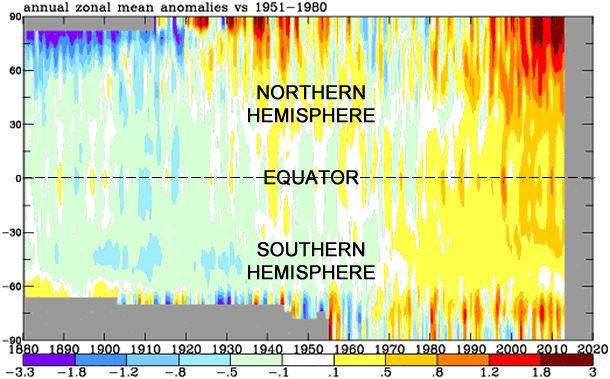
If you have any doubt the balance of the globe has warmed over the last century, view this chart:
Produced by NASA, the chart illustrates how temperatures have compared to “normal” (or the 1951-1980 average) from 1880 to present, from pole to pole (-90 latitude to 90 latitude).From the 1880 to the 1920s, blue and green shades dominate the chart, signaling cooler than normal temperatures in that era. Then, from the 1930s to the 1970s, warmer yellow, oranges, and reds shades ooze in, balancing the cooler shades.
But since the 1970s, the blue and green shades rapidly erode and oranges and reds take over, dramatically…
But as we know, NASA has manipulated its temperatures.
That’s it!
They have a GRAPHIC!
We might as well toss in the towel.
A licensed mechanical engineer (retired) who has been researching this issue (unfunded) for 6 years, and in the process discovered what actually caused global warming and why it ended, has four papers on the web that you may find of interest. They provide some eye-opening insight on the cause of change to average global temperature and why it has stopped warming. The papers are straight-forward calculations (not just theory) using readily available data up to May, 2013. (data through July made no significant difference)
The first one is ‘Global warming made simple’ at http://lowaltitudeclouds.blogspot.com It shows, with simple thermal radiation calculations, how a tiny change in the amount of low-altitude clouds could account for half of the average global temperature change in the 20th century, and what could have caused that tiny cloud change. (The other half of the temperature change is from net average natural ocean oscillation which is dominated by the PDO)
The second paper is ‘Natural Climate change has been hiding in plain sight’ at http://climatechange90.blogspot.com/2013/05/natural-climate-change-has-been.html . This paper presents a simple equation that, using a single external forcing, calculates average global temperatures since they have been accurately measured world wide (about 1895) with an accuracy of 90%, irrespective of whether the influence of CO2 is included or not. The equation uses a proxy which is the time-integral of sunspot numbers (the external forcing). A graph is included which shows the calculated trajectory overlaid on measurements.
Change to the level of atmospheric CO2 has had no significant effect on average global temperature.
The time-integral of sunspot numbers since 1610 which is shown at http://hockeyschtick.blogspot.com/2010/01/blog-post_23.html corroborates the significance of this factor.
A third paper, ‘The End of Global Warming’ at http://endofgw.blogspot.com/ expands recent (since 1996) measurements and includes a graph showing the growing separation between the rising CO2 and not-rising average global temperature.
The fourth paper http://consensusmistakes.blogspot.com/ exposes some of the mistakes that have been made by the ‘Consensus’ and the IPCC
How many manhours was spent producing a totally incomprehensible and meaningless graphic? Surely those folks have something better to do.
Now we know what NASA stands for: Not A Scientist Anywhere
Nate,
What I have is that Leon weas Clara’s father and Rose her mother. I have found no siblings. Leon’s father was, I think Sam and his mother Lona Altersong.
Beyond that I have nothing more on Clara’s family.
On the Katchers, though I do have more and would be happy to share.
irv