Ross McKitrick writes:
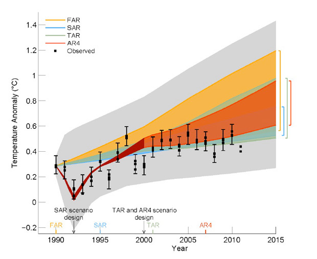
The IPCC graph shows that climate models [that provided the foundation for its first four Assessment Reports] predicted temperatures should have responded by rising somewhere between about 0.2 and 0.9 degrees C [post-1990]. But the actual temperature change was only about 0.1 degrees, and was within the margin of error around zero. In other words, models significantly over-predicted the warming effect of CO2 emissions for the past 22 years,” wrote Dr. Ross McKitrick, an expert reviewer for the Intergovernmental Panel on Climate Change (IPCC), Associate Professor of Economics at the University of Guelph, Ontario, Canada, and a member of the Cornwall Alliance Advisory Board who has co-authored several of our major papers.
Hockey stick and all about the same slope? These guys maintain their assumptions and are not confused by the facts.
If I’m reading the chart correctly, the high error bar for “observed” is below the minimum prediction of AR4 in 2000, low in the AR4 range in 2010, and below AR4 for this year. That, and the curve from 1990 to now is essentially flat. Embarrassing indeed if warmists were capable of embarrassment.