Check out the Greenland ice core for the relevant period of time.
As can be plainly seen, modern warming isn’t even close to the “highest” in the past 4,000 years.
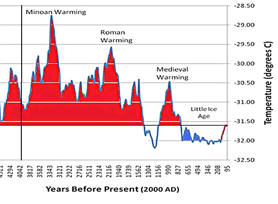
Click for the JunkScience article about the original study.
[h/t Don Easterbrook]
Check out the Greenland ice core for the relevant period of time.
As can be plainly seen, modern warming isn’t even close to the “highest” in the past 4,000 years.
Click for the JunkScience article about the original study.
[h/t Don Easterbrook]
This is a fraudulent misrepresentation. The last data point is in 1855, long before current warming, yet it’s colored red to suggest that’s the case. If we added the temperature record from nearby Greenland Summit after 1855 to present the values would be out the top of the graphic.
It’s also not a global paleotemperature reconstruction but from a single location in one of the least representative locations.
Joke’s on you. All paleo is garbage for temps.
Comparing apples and oranges here. 4k reconstruction is based on worlwide average, greenland ice core samples are just that – regional. Major mistake.
Notice how CO2 data isn’t shown on the 10K year “reconstruction.”
CO2 was basically in a 260-280ppm flatline for the 10K yr. period with temperatures rising and falling, seemingly unaffected by CO2.
They shouldn’t “credit” CO2 with the recent temperature rise (and current 17 year flatline) OR be willing to take lumps for CO2’s not doing so in the past!!!
http://www.ncdc.noaa.gov/paleo/icecore.html
The baseline is quite obviously set at the current temp, which should really be neither here nor there (it just gives you an indication along the x axis how much higher temps were than today). Its also in negative because its an ice core sample, and well you need it to be negative for there to be ice 😛
Where does the Greenland ice core data come from?
Extensive forests would be consistent with hippos on the Thames during the Eemian.
Ice core data doesn’t go all the way to present (because recent information is still in snow, not ice). So there will be some extension of temperature above zero if you wanted to go to the present, but you would have to splice an instrumental record on top of this time series. Pretty hard to do apples to apples comparison with that. The baseline is simply a line drawn through the end of the series and extended back in time. Areas in red are higher than the temperatures 95 years before 2000 (1905).
Notice anything unusual about the slopes and details? They are well accepted, and you don’t see anything unusual even after the beginning of the industrial revolution. But the new study wipes out the MWP and is unable to resolve all of the rest of the details you see in the GISP2 cores. The general shape is retained, but all resolution is smeared together. I’d be willing to bet that in the coming days, we will see that the proxy data were selected such that hockey sticks are produced (pick the ones that have a response to CO2 but not necessarily to temperature – e.g. tree rings and others). This can be done by a number of dubious statistical techniques that the Team has mastered. We’ll see if that turns out to be the case with this one as real scientists try to replicate the results. I doubt this one will stand. Most of these are “commissioned” studies, pay to play “science” with a desired policy goal result. (see, it’s worse than we thought)… If it is like most hockey sticks, it’s going to get a hip check into the boards. Most of these have a shelf life of days to weeks. This one might be hours.
https://junkscience.com/2013/03/07/new-study-extends-hockey-stick-back-11300-years/
A couple of years ago, the Journal Science published findings from ice core drilling in the central Greenland massif revealed something surprising. During the middle of the Pleistocene Ice Age, there were three warm periods sufficient to leave pollen evidence that Greenland was covered with extensive forests. Damn those Homo Habilis coal-fired electric plants! Serves them right to go extinct. Will Homo Sapiens learn anything?
Where is the link to the original article? I must be blind, because I don’t see it.
The scale at the right is confusing me badly. The positioning seems to say that current trends have only just reached the baseline, but how was the baseline established? And why is the y axis stated in negative terms? Too lazy to follow a link to an article more technical than I will grasp.