28 thoughts on “What you need to know about climate modeling in one graph”
(MODERATOR: I posted this reply and a short follow-up to correct an error 2 or 3 days ago, but it has yet to be published. I’ve just tweaked it and am trying again. Please disregard those earlier replies.)
The “nearly 1.5 degrees C per decade ” was a typo, and I’m wincingly grateful that you caught it, 2CentsWorth (that was worth at least a dollar). I hope you don’t think I deliberately made such a patently ridiculous exaggeration. What I meant to write was “per century,” as I wrote a few sentences later regarding the “2.5 degrees C per century” trend over land, based on BEST and NOAA.
I have to take issue with the way you choose to characterize what the UAH dataset shows about warming since 1979. You write: “what it really shows is a current trend of only ~0.07+ C* above the running 30yr mean, and a total change of only ~0.3+ C* during the more than 3 decades since 1979″
Unless, I’m misunderstanding you, you’ve chosen to disregard standard statistical methods of estimating change via linear regression trends in favour of the statistically and scientifically unacceptable comparison of single start and end points (1979 vs 2013) in a highly volatile/”noisy” series of data points. Using the trend calculator here (http://www.skepticalscience.com/trend.php – I know people in your camp hate anything to do with SkS, but even Werner Brozek has used this calculator in a guest post on WUWT ((http://wattsupwiththat.com/2013/03/05/has-global-warming-stalled-now-includes-january-data/); I have yet to see anyone question the neutrality of the calculator which crunches the numbers from various datasets), I get the following trends for UAH and RSS (1979-2014 – “2014” includes the early data for this year):
Those very statistically significant trends ARE well within the 95% confidence limits of the IPCC models for the scenarios that best fit the carbon emissions we’ve seen. I would guess they’re well within the one SD, 67% CI limits too.
You write:
“Furthermore, according to the Pro-CAGW “hypothesis” of CO2-Driven Global Warming, it’s the tropical troposphere in which the temp-trend is supposed to be the most noticeable & the most drastic, which is why that particular location & altitude is often used as the bell-weather of the “Global” trend detection.”
Agreed that climate science predicts that if the planet’s surface is warming there should be a “hot spot” in the tropical troposphere, but this prediction isn’t specific to warming due to an increased greenhouse effect. It’s for any forcing, including, say, increased solar irradiance. So if we believe that the failure, so far, to record that hot spot means there “is” no hot spot, we either have to abandon or revise that prediction, throw out all the independent evidence that the planet has warmed nearly 1 degree C since 1900 and – using Spencer and Christy’s UAH dataset alone – nearly 0.5 degrees since 1979 (look for the trend in Spencer’s graph without cherry-picking: http://www.drroyspencer.com/wp-content/uploads/UAH_LT_1979_thru_May_2013_v5.5.png) or consider the possibility that measurement error is responsible for the lack of an observed hotspot. On that score, let me just quote what I wrote when this issue recently came up on the Facebook page of “Friends of Science” (a Canadian group like CFACT):
>* Global-average tropospheric temperature
increased at a rate of about 0.14ºC per decade
since 1958 according to the two radiosonde
data sets. For the period from 1979, temperature increased by 0.10ºC to 0.20ºC per
decade according to the two radiosonde
and three satellite data sets. In the tropics,
temperature increased at about 0.13ºC per
decade since 1958, and between 0.02ºC and
0.19ºC per decade since 1979.
>* Errors in observed temperature trend differences between the surface and the troposphere are more likely to come from errors in
tropospheric data than from errors in surface
data.
[end quote]
Also, please note that when ALL of the tropical measurement data is included, not just what Spencer used for his “epic fail” rant, Christy et al. write that the warming trend has been “between 0.02ºC and 0.19ºC per decade since 1979.” That’s not a hot spot, but it ain’t the flat curve in Spencer’s epic fail either.
____
You write:
“… according to even the UK’s own Met-Office & CRU, yes there has indeed been no statistically significant or detectable “Global” warming over the last ~16-20 yrs, as Skeptics have said.”
True, for all or most datasets, the current warming trend has fallen below the 95% significance level for years starting in the mid- to late-90s. In the 40 or so years since the long mid-20th century lag, we’ve had one other comparably long pause in surface temperature warming from around 1979 to 1997. Most datasets showed an statistically insignificant 18-year trend of ~1 degree per century. UAH was just 0.034 ±0.177 °C/decade (2σ). But anyone who said global warming has stopped back then would have had to eat their words just a couple years later. By 1999, HadCRUT4 – the basis for the “no global warming” Daily Mail graph published last fall – was showing this robust warming trend since 1979:
0.167 ±0.101 °C/decade (2σ) – i.e., “no global warming” had become global warming at a pace of 0.66 to 2.68 degrees per century, about 49 times out of 50, if I’m interpreting SkS’s fine print correctly (“β=0.016661 σw=0.0014919 ν=11.425 σc=σw√ν=0.0050428”).
As long as surface temperature is constrained by a multitude of substantial short-term natural forcings – notably, ENSO, solar variance and volcanoes – we can count on them to occasionally skew the anthropogenic warming trend away from significance or even flatten or cool it for periods as long as 15-20 years and perhaps (still, despite the acceleration in GHG emissions since the late 20th century) longer. The deeper question always is “what’s left after we’ve adjusted the temperature trend to remove those natural forcings?” On that score, have you read this 2011 study (http://iopscience.iop.org/1748-9326/6/4/044022/fulltext/) and used this trend calculator that employs its data (good from 1979-2011): http://www.skepticalscience.com/trend-fr.php? You only have to go back 10 years to get a significant warming trend from the Met Office’s CRUT3 dataset (2001-2011: Trend: 0.110 ±0.102 °C/decade (2σ)).
____
About the quote from NOAA: It’ been presented to me at least twice in the last few weeks, so I’ve had cause to look into it. Here’s what I wrote about it the last time on the Facebook page of CFACT where a commenter cited it in the context of that guest post by Werner Brozek on WUWT (http://wattsupwiththat.com/2013/03/05/has-global-warming-stalled-now-includes-january-data/):
Brozek builds his case on a quote from a 2008 NOAA document. Here it is in context, with the part quoted by B surrounded by asterisks:
>We can place this apparent lack
of warming in the context of natural climate fluctuations other than
ENSO using twenty-first century
simulations with the HadCM3 climate model (Gordon et al. 2000),
which is typical of those used in the
recent IPCC report (AR4; Solomon
et al. 2007). Ensembles with different modifications to the physical
parameters of the model (within
known uncertainties) (Collins et al.
2006) are performed for several of
the IPCC SRES emissions scenarios
(Solomon et al. 2007). Ten of these
simulations have a steady long-term
rate of warming between 0.15°
and 0.25ºC decade–1, close to the
expected rate of 0.2ºC decade–1.
>ENSO-adjusted warming in the
three surface temperature datasets
over the last 2–25 yr continually lies within the 90% range of
all similar-length ENSO-adjusted
temperature changes in these
simulations (Fig. 2.8b). Near-zero
and even negative trends are common for intervals of a decade or
less in the simulations, due to the
model’s internal climate variability.
***The simulations rule out (at the
95% level) zero trends for intervals
of 15 yr or more, suggesting that
an observed absence of warming of
this duration is needed to create
a discrepancy with the expected
present-day warming rate.***
This quote has been shared with me before in order to make the same argument. I have very serious problems with it, or at least the interpretation that Brozek and others draw from it, i.e. that in 2008 NOAA said that if we encounter a 15-year or greater period without significant warming (at the 95% confidence level), then there’s something problematic (“discrepant”) about the models of “present-day warming.”
My first problem with this is that NOAA’s meaning is ambiguous. Given what they wrote just above it, are they not talking about ENSO-adjusted warming? It seems to me they are, in which case the many nonsignificant warming trends (depending on the dataset) since 1998 and sometimes longer that Brozek goes on to show aren’t applicable, because they’re not ENSO-adjusted. Brozek doesn’t even mention ENSO. But my point is made in the comments section here: http://wattsupwiththat.com/2013/03/05/has-global-warming-stalled-now-includes-january-data/#comment-1239457. Brozek responds by conceding there’s room for interpretation, but then he says:
>But even if NOAA never made any such statement, Ben Santer in effect said that if the slope is 0 for 17 years, then something is wrong with the models. This is totally consistent with NOAA’s statement. See: http://www.agu.org/pubs/crossref/2011/2011JD016263.shtml
“A single decade of observational TLT [temperature of the lower troposphere] data is therefore inadequate for identifying a slowly evolving anthropogenic warming signal. Our results show that temperature records of at least 17 years in length are required for identifying human effects on global-mean tropospheric temperature.”
-end of Brozek quote-
This only creates another interpretation problem. Santer didn’t say that lack of significant warming in the satellite datasets (these are the only ones that measure TLT) for 17 or more years disproves the modelled predictions. He said it takes **at least 17 years** to find a significant AGW signal. Also, Santer said this in a paper published late in 2011. The UAH trend from 1994 to 2011 was already NOT significant (Trend: 0.185 ±0.200 °C/decade (2σ) – http://www.skepticalscience.com/trend.php). When Santer submitted his paper, he wouldn’ have had data thru 2011, but the 17-year UAH trend thru 2010 also is nonsignificant. Visit http://www.skepticalscience.com/trend.php and see how many more pre-2010-11 17-year or greater NS trends in the UAH and RSS datasets you can find.
Perhaps we need to look inside Santer’s paper to better understand what he meant. I can find only one reference to 17 years:
“On timescales longer than 17 years, the average trends in RSS and UAH near-global TLT data consistently exceed 95% of the unforced trends in the CMIP-3 control runs (Figure 6d).”
So Santer isn’t talking about raw satellite temperature trends, but the difference between those trends and “the unforced trends in the CMIP-3 control runs.” Brozek needs to produce data that falsifies Santer claim as stated here, but he doesn’t even mention CMIP-3 control runs.
My second problem (and it should be your problem too) is this: in 2008, NOAA’s own raw temperature data had recently – repeatedly – not found significant warming over 15 year and greater periods. Here’s the data which I calculated myself using the same SkS calculator that Brozek uses:
There may be more such NS trends during what NOAA refers to in the 2008 quote as “present-day warming.” (If we go back to mid-century, I’ve found nonsignificant trends as long as 50 years.) So, logically, would NOAA defy not only what climate scientists commonly understand about the noisiness of short-term unadjusted surface and tropospheric temperature measurements and the evidence from its own temperature records, or was NOAA, as the context (and climate science) suggests, talking about ENSO-adjusted periods of 15-years or more?
_____
Finally, about the alleged goal-post moving by “all the Pro-CAGW Alarmists,” from my answers above, putting your claims into context (e.g. the NOAA quote), I don’t see any evidence of it. Also, you leave out important instances where climate change has moved faster than consensus climate science has estimated: sea level rise, Arctic temperature rise and ice loss (especially by volume), glacier melt and disappearance…
Sorry, above that should’ve read; …”what it really shows is a current trend of only ~0.07+ C* above the running 30yr mean, and a total change of only ~0.3+ C* during the more than 3 decades since 1979″.
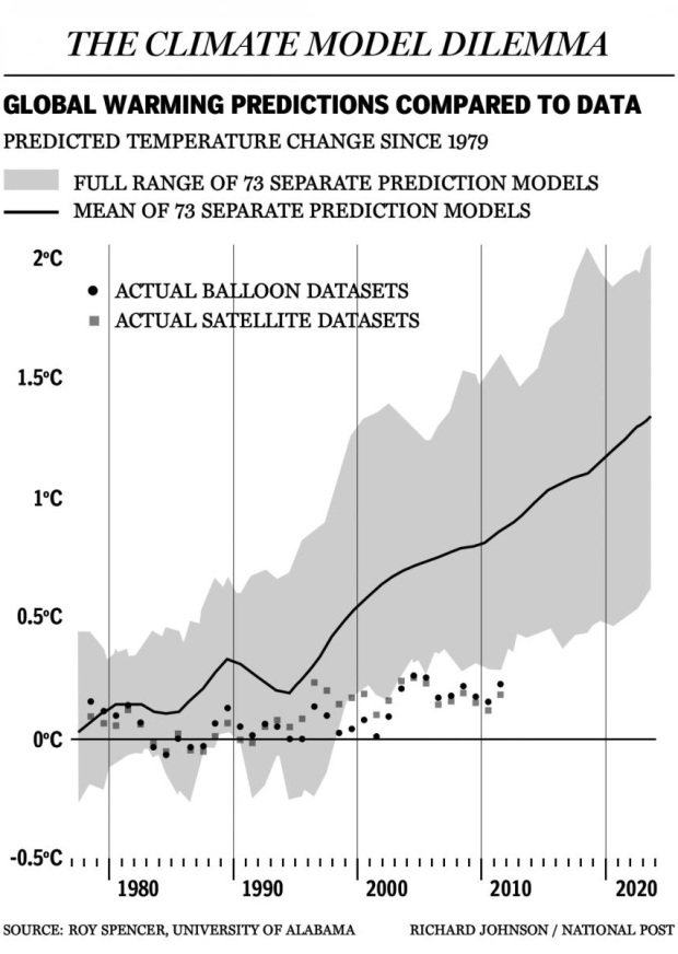
What’s even more curious Syd is that you’d confuse a number of things here, including your claim that the Global UAH dataset shows a trend of, “nearly +1.5 degrees C per decade since 1979”, when what it really shows is a current tread of only ~0.07+ C* over the more than 3 decades since 1979 instead. And no, that’s definitely not well within the margin of error of the IPCC’s own model predictions as of AR4. Furthermore, according to the Pro-CAGW “hypothesis” of CO2-Driven Global Warming, it’s the tropical troposphere in which the temp-trend is supposed to be the most noticeable & the most drastic, which is why that particular location & altitude is often used as the bell-weather of the “Global” trend detection. Lastly, according to even the UK’s own Met-Office & CRU, yes there has indeed been no statistically significant or detectable “Global” warming over the last ~16-20 yrs, as Skeptics have said. Something which both the UK’s CRU and the USA’s NOAA both proclaimed could not happen according to their GCM Climate Models. http://www.dailymail.co.uk/sciencetech/article-2217286/Global-warming-stopped-16-years-ago-reveals-Met-Office-report-quietly-released–chart-prove-it.html … http://tinypic.com/r/22ahr6/5 … http://tomnelson.blogspot.com/2012/10/new-phil-jones-quote-dont-know-what.html …
And here’s a quote from the NOAA themselves; “The simulations {models} rule out (at the 95% level) zero trends for intervals of 15 yr or more, suggesting that an observed absence of warming of this duration is needed to create a discrepancy with the expected present-day warming rate.” … http://rogerpielkejr.blogspot.com/2009/07/noaa-explains-global-temperature.html
That “observed absence of warming” for intervals of 15 yrs or more is exactly what we’ve now seen.
It’s curious that the title of this graph is “global warming predictions compared to data,” yet the graph only compares what Spencer says are *tropical tropospheric* temperatures to the models (presumably for the tropical troposphere). On the other hand, when it comes to actual *global* warming, Spencer and Christy’s own UAH dataset (http://www.drroyspencer.com/wp-content/uploads/UAH_LT_1979_thru_May_2013_v5.5.png) shows a statistically significant warming trend of nearly 1.5 degrees C per decade since 1979 compared to a modelled rise (for the level of GHG increases we’ve seen) of about 2-2.5 degrees. The difference is well within the margin of error, and the most important lesson to be drawn from it (and all the other satellite and land-based datasets, which show comparable or greater rates of warming) is that the planet has warmed significantly since the 1970s. It hasn’t stopped warming or cooled as contrarians typically insist it will. In fact, over the same time period, the global mean surface temperature over land only has been rising at a rate greater than 2.5 degrees C per century according to both the BEST (partially funded by the Koch brothers; endorsed by Anthony Watts until it reported its findings) and the NOAA datasets.
…”To suggest over-exaggerated suggests some sort of conspiracy on behalf of the researchers using the GRACE data.”…
On the contrary, no it doesn’t. I suspect that’s all in your mind. All it “suggests” – (ie: states factually, really) – is that they determined that a number of mistakes were made in previous studies which “over-exaggerated” the previous study’s results. Period.
…”there is a lack of reliable data to test the Grace results for West Antarctica where the loss of ice is most dramatic.”…
Oh, you mean the “West of Antarctica” – where it says what you seem to want it to say most of all – also happens to be the area with the most unreliable data? Which means that the supposed “most dramatic” ice loss may indeed not be all that dramatic after all? Then yes, I agree. BTW, I’d also agree that this argument/debate is not done yet, which is why “The Science is {not} settled” just yet as well. That fact also tends to support the graphed results which are the very subject of this comment-thread. I look forward to continued scientific studies being done on this subject,
Cheers, Tyrone.
2Centsworth
“I like to think that I’m led by the science once a consensus is reached”. Science is not dependent on consensus.
To suggest over-exaggerated suggests some sort of conspiracy on behalf of the researchers using the GRACE data. My understanding is that this is down to which datasets are used. The study you are quoting also outlines it’s own limitations in that there is a lack of reliable data to test the Grace results for West Antarctica where the loss of ice is most dramatic. This suggests to me that this argument is not done yet nor does it rubbish the research done on the latest GRACE results.
Were i still in my previous job I’d have asked our CSO to give me a read on this…as it is i can only approach this from a layman’s standpoint and weigh up all of the research published…It seems to me that there are a few more rounds to go on this…I’m not a zealot either way. I like to think that I’m led by the science once a consensus is reached.
No Tyrone, the latest peer-reviewed science clearly shows that the previous loss estimates were in fact highly over-exaggerated. Here’s yet another one of the more recent peer-reviewed studies & papers, produced by an international team of scientists & lead by a group from our own JPL in Pasadena, CA, (Ivans et al, 2013), just published in the highly respected “Journal of Geophysical Research”, which concludes that the Antarctic’s GIA was poorly accounted for before in earlier GRACE Antarctic Ice Mass studies, and so actual Land Ice Melt is recalculated to be at least “70% LESS” than previously estimated. According to their corrections this is the equivalent of at least “50 to 90 Gt/yr” less melt than previously estimated, resulting in an “upper bound” of ONLY ~0.16mm/yr in sea level rise, not the 1mm/yr that you claimed. — http://notrickszone.com/2013/06/15/new-study-shows-antarctica-ice-is-melting-70-more-slowly-than-thought-another-scare-bites-the-dust/ …. http://onlinelibrary.wiley.com/doi/10.1002/jgrb.50208/abstract
“But the loss is accelerating and there may well be a point where a balance shifts more dramatically as some significant point is reached like for example the balance of salinity of the southern oceans is changed…”
Send us a memo when it happens.
And save your ad hominems for people who don’t recognize them. They don’t work here.
The science sets out clearly that the loss is the equivalent of 1mm a year rise which while is statistically significant doesn’t seem to be much too worry about. But the loss is accelerating and there may well be a point where a balance shifts more dramatically as some significant point is reached like for example the balance of salinity of the southern oceans is changed…
I keep being to that there is a gain not a loss…when the science disproves that then we move onto well there is no rise…
Like i said..head in sand.
“net loss of ice per year is about 69 billion tonnes”
I repeat, for the hard of hearing, an alleged massive melt with no corresponding change in sea level means the melt is irrelevant.
Thank you. I hadn’t picked up on the latest published data.
While the initial estimates have been re-assessed the new study shows in it’s overall findings that there is still currently a net annual loss of ice on the continent. The lead researcher is clear on this. Although parts of East Antarctica are growing, glaciers in West Antarctica are melting faster, leading to a net loss of ice across the continent. And that this rate of loss is accelerating.
”We’re confident that the ice cover is shrinking, and the rate along the Amundsen Sea coast is accelerating,” said the lead researcher Professor Matt King.
Yes rapid melting in some parts of the continent is partially offset by heavy snowfalls elsewhere but that still results in net loss of ice per year is about 69 billion tonnes.
Yes Tyrone, it would appear that real & unbiased science IS a bit ‘inconvenient’… for your side’s own ‘Alarmist’ POV, that is. The info you’re citing on GRACE measurements of Antarctic Land Ice Mass is older & taken from when the GRACE satellites were still just getting fully calibrated. As such it’s a bit obsolete & inaccurate, especially when compared to the most recent GRACE data from just last year, in 2012. Those initial estimates you’re citing are considered to be a bit questionable & in fact have been much in dispute in the scientific community. Especially due to the fact that some of the most recent peer-reviewed scientific studies (Grace, Pippa, et al, Dec/2012) show that the only relatively minor land ice mass loss in Antarctica has been on the relatively isolated Western Peninsula, which is effected by other natural causes to a far greater extent than the much larger remainder of the Antarctic continent which makes up ~65-70% of Antarctica. According to the Dec/2012 Grace-Pippa study mentioned above, which uses both the most recent & recalibrated GRACE measurements plus radar altimetry combined with direct ice core measurements, in the much larger remainder of Antarctica, (which again makes up ~65-70% of Antarctica), Land Ice Mass has actually been increasing in recent years, not decreasing. … http://www.agu.org/pubs/crossref/pip/2012GL052559.shtml … http://hockeyschtick.blogspot.com/2012/09/grace-satellite-data-shows-antarctica.html
Head…sand…truly buried.
Since there has been no change in the rate of sea level rise since 2002, your 240 cubic miles of ice melt are irrelevant, and we can now quit worrying about it at all.
I know science is inconvenient but Gravity data collected from space using NASA’s Grace satellite shows that Antarctica has been losing mass at the rate of more than a hundred cubic km (24 cubic miles) of ice each year since 2002. The latest data shows that Antarctica is losing ice at an accelerating rate…This mass loss is also backed up by Radar data from the west of Antarctica which shows the line between the glacier’s floating section and the part of the glacier that rests on the sea floor has retreated towards the land. That meant that the glacier was losing mass.
It is the loss of land ice in the southern hemisphere which is important because that will contribute to sea level rise…loss or gain of sea ice has little real effect on sea level.
Tyrone writes “Land ice in the southern hemisphere is decreasing” Is this a well established fact from satellite data? not that I have seen. It IS disputed over whether SH sea ice “volume” is increasing as well as coverage. However, due to the extreme temps in that part of the world, with the exception of the Antarctic Peninsula, it is highly unlikely that the mass of land ice is decreasing. Plus, due to more moisture content in the atmosphere, there is more snow recorded and lower temps being recorded in the middle of the continent. So the likelihood is it’s mass is growing not shrinking. I would challenge your ability to look at the wider picture.
Actually sea ice on some sides of the southern continent is increasing showing an overall increase in sea ice. Land ice is still decreasing dramatically adding large amounts of fresh water to the southern oceans which in itself might be the reason for the increase in sea ice…
Typical of somebody taken in by pseudo-science to focus on one indicator and ignore the wider picture.
“Once they’re gone, all hell breaks loose.”
Remember, they weren’t there once.
So where was the evidence of hell in the past when they were gone previously? Data, please?
Why wouldn’t it be good for people to be able to farm in Greenland? Why would you want land covered with ice?
It junks itself.
The old claim was: all the glaciers and ice caps are melting because the temperature is increasing.
We point out that the temperature hasn’t increased nearly as much in the last 30 years as models suggested and your response is that it’s because all the glaciers and ice caps are melting?
Oh, and Dana: that should be “ice cap” singular. Ice in the southern hemisphere is growing.
Dana, you miss the point. If CO2 is not the cause of your hell-breaking ice-melting nightmares (as the observations suggest), then reducing it ain’t the solution. Is that so hard for you to grasp?
Don’t look at those shrinking glaciers and ice caps. These are the thermal regulators of the planet. Once they’re gone, all hell breaks loose. So junk that.
Snorbert: A heap of spaghetti, yeah, but one where the strands pretty much stick together pointing in the wrong direction
I would that by looking at this, not only are the models way off, but the balloon and satellite datasets are showing cooler than 1979. But I’m no expert.
Leave a Reply
Discover more from JunkScience.com
Subscribe now to keep reading and get access to the full archive.
(MODERATOR: I posted this reply and a short follow-up to correct an error 2 or 3 days ago, but it has yet to be published. I’ve just tweaked it and am trying again. Please disregard those earlier replies.)
The “nearly 1.5 degrees C per decade ” was a typo, and I’m wincingly grateful that you caught it, 2CentsWorth (that was worth at least a dollar). I hope you don’t think I deliberately made such a patently ridiculous exaggeration. What I meant to write was “per century,” as I wrote a few sentences later regarding the “2.5 degrees C per century” trend over land, based on BEST and NOAA.
I have to take issue with the way you choose to characterize what the UAH dataset shows about warming since 1979. You write: “what it really shows is a current trend of only ~0.07+ C* above the running 30yr mean, and a total change of only ~0.3+ C* during the more than 3 decades since 1979″
Unless, I’m misunderstanding you, you’ve chosen to disregard standard statistical methods of estimating change via linear regression trends in favour of the statistically and scientifically unacceptable comparison of single start and end points (1979 vs 2013) in a highly volatile/”noisy” series of data points. Using the trend calculator here (http://www.skepticalscience.com/trend.php – I know people in your camp hate anything to do with SkS, but even Werner Brozek has used this calculator in a guest post on WUWT ((http://wattsupwiththat.com/2013/03/05/has-global-warming-stalled-now-includes-january-data/); I have yet to see anyone question the neutrality of the calculator which crunches the numbers from various datasets), I get the following trends for UAH and RSS (1979-2014 – “2014” includes the early data for this year):
UAH: Trend: 0.138 ±0.072 °C/decade (2σ)
RSS: Trend: 0.130 ±0.071 °C/decade (2σ)
Those very statistically significant trends ARE well within the 95% confidence limits of the IPCC models for the scenarios that best fit the carbon emissions we’ve seen. I would guess they’re well within the one SD, 67% CI limits too.
You write:
“Furthermore, according to the Pro-CAGW “hypothesis” of CO2-Driven Global Warming, it’s the tropical troposphere in which the temp-trend is supposed to be the most noticeable & the most drastic, which is why that particular location & altitude is often used as the bell-weather of the “Global” trend detection.”
Agreed that climate science predicts that if the planet’s surface is warming there should be a “hot spot” in the tropical troposphere, but this prediction isn’t specific to warming due to an increased greenhouse effect. It’s for any forcing, including, say, increased solar irradiance. So if we believe that the failure, so far, to record that hot spot means there “is” no hot spot, we either have to abandon or revise that prediction, throw out all the independent evidence that the planet has warmed nearly 1 degree C since 1900 and – using Spencer and Christy’s UAH dataset alone – nearly 0.5 degrees since 1979 (look for the trend in Spencer’s graph without cherry-picking: http://www.drroyspencer.com/wp-content/uploads/UAH_LT_1979_thru_May_2013_v5.5.png) or consider the possibility that measurement error is responsible for the lack of an observed hotspot. On that score, let me just quote what I wrote when this issue recently came up on the Facebook page of “Friends of Science” (a Canadian group like CFACT):
Even John Christy has co-written a report that speculates the lack of an observed tropical hotspot so far – well, let me just quote from what he and others wrote (http://www.climatescience.gov/Library/sap/sap1-1/finalreport/sap1-1-final-execsum.pdf):
>* Global-average tropospheric temperature
increased at a rate of about 0.14ºC per decade
since 1958 according to the two radiosonde
data sets. For the period from 1979, temperature increased by 0.10ºC to 0.20ºC per
decade according to the two radiosonde
and three satellite data sets. In the tropics,
temperature increased at about 0.13ºC per
decade since 1958, and between 0.02ºC and
0.19ºC per decade since 1979.
>* Errors in observed temperature trend differences between the surface and the troposphere are more likely to come from errors in
tropospheric data than from errors in surface
data.
[end quote]
Also, please note that when ALL of the tropical measurement data is included, not just what Spencer used for his “epic fail” rant, Christy et al. write that the warming trend has been “between 0.02ºC and 0.19ºC per decade since 1979.” That’s not a hot spot, but it ain’t the flat curve in Spencer’s epic fail either.
____
You write:
“… according to even the UK’s own Met-Office & CRU, yes there has indeed been no statistically significant or detectable “Global” warming over the last ~16-20 yrs, as Skeptics have said.”
True, for all or most datasets, the current warming trend has fallen below the 95% significance level for years starting in the mid- to late-90s. In the 40 or so years since the long mid-20th century lag, we’ve had one other comparably long pause in surface temperature warming from around 1979 to 1997. Most datasets showed an statistically insignificant 18-year trend of ~1 degree per century. UAH was just 0.034 ±0.177 °C/decade (2σ). But anyone who said global warming has stopped back then would have had to eat their words just a couple years later. By 1999, HadCRUT4 – the basis for the “no global warming” Daily Mail graph published last fall – was showing this robust warming trend since 1979:
0.167 ±0.101 °C/decade (2σ) – i.e., “no global warming” had become global warming at a pace of 0.66 to 2.68 degrees per century, about 49 times out of 50, if I’m interpreting SkS’s fine print correctly (“β=0.016661 σw=0.0014919 ν=11.425 σc=σw√ν=0.0050428”).
As long as surface temperature is constrained by a multitude of substantial short-term natural forcings – notably, ENSO, solar variance and volcanoes – we can count on them to occasionally skew the anthropogenic warming trend away from significance or even flatten or cool it for periods as long as 15-20 years and perhaps (still, despite the acceleration in GHG emissions since the late 20th century) longer. The deeper question always is “what’s left after we’ve adjusted the temperature trend to remove those natural forcings?” On that score, have you read this 2011 study (http://iopscience.iop.org/1748-9326/6/4/044022/fulltext/) and used this trend calculator that employs its data (good from 1979-2011): http://www.skepticalscience.com/trend-fr.php? You only have to go back 10 years to get a significant warming trend from the Met Office’s CRUT3 dataset (2001-2011: Trend: 0.110 ±0.102 °C/decade (2σ)).
____
About the quote from NOAA: It’ been presented to me at least twice in the last few weeks, so I’ve had cause to look into it. Here’s what I wrote about it the last time on the Facebook page of CFACT where a commenter cited it in the context of that guest post by Werner Brozek on WUWT (http://wattsupwiththat.com/2013/03/05/has-global-warming-stalled-now-includes-january-data/):
Brozek builds his case on a quote from a 2008 NOAA document. Here it is in context, with the part quoted by B surrounded by asterisks:
>We can place this apparent lack
of warming in the context of natural climate fluctuations other than
ENSO using twenty-first century
simulations with the HadCM3 climate model (Gordon et al. 2000),
which is typical of those used in the
recent IPCC report (AR4; Solomon
et al. 2007). Ensembles with different modifications to the physical
parameters of the model (within
known uncertainties) (Collins et al.
2006) are performed for several of
the IPCC SRES emissions scenarios
(Solomon et al. 2007). Ten of these
simulations have a steady long-term
rate of warming between 0.15°
and 0.25ºC decade–1, close to the
expected rate of 0.2ºC decade–1.
>ENSO-adjusted warming in the
three surface temperature datasets
over the last 2–25 yr continually lies within the 90% range of
all similar-length ENSO-adjusted
temperature changes in these
simulations (Fig. 2.8b). Near-zero
and even negative trends are common for intervals of a decade or
less in the simulations, due to the
model’s internal climate variability.
***The simulations rule out (at the
95% level) zero trends for intervals
of 15 yr or more, suggesting that
an observed absence of warming of
this duration is needed to create
a discrepancy with the expected
present-day warming rate.***
This quote has been shared with me before in order to make the same argument. I have very serious problems with it, or at least the interpretation that Brozek and others draw from it, i.e. that in 2008 NOAA said that if we encounter a 15-year or greater period without significant warming (at the 95% confidence level), then there’s something problematic (“discrepant”) about the models of “present-day warming.”
My first problem with this is that NOAA’s meaning is ambiguous. Given what they wrote just above it, are they not talking about ENSO-adjusted warming? It seems to me they are, in which case the many nonsignificant warming trends (depending on the dataset) since 1998 and sometimes longer that Brozek goes on to show aren’t applicable, because they’re not ENSO-adjusted. Brozek doesn’t even mention ENSO. But my point is made in the comments section here: http://wattsupwiththat.com/2013/03/05/has-global-warming-stalled-now-includes-january-data/#comment-1239457. Brozek responds by conceding there’s room for interpretation, but then he says:
>But even if NOAA never made any such statement, Ben Santer in effect said that if the slope is 0 for 17 years, then something is wrong with the models. This is totally consistent with NOAA’s statement. See:
http://www.agu.org/pubs/crossref/2011/2011JD016263.shtml
“A single decade of observational TLT [temperature of the lower troposphere] data is therefore inadequate for identifying a slowly evolving anthropogenic warming signal. Our results show that temperature records of at least 17 years in length are required for identifying human effects on global-mean tropospheric temperature.”
-end of Brozek quote-
This only creates another interpretation problem. Santer didn’t say that lack of significant warming in the satellite datasets (these are the only ones that measure TLT) for 17 or more years disproves the modelled predictions. He said it takes **at least 17 years** to find a significant AGW signal. Also, Santer said this in a paper published late in 2011. The UAH trend from 1994 to 2011 was already NOT significant (Trend: 0.185 ±0.200 °C/decade (2σ) – http://www.skepticalscience.com/trend.php). When Santer submitted his paper, he wouldn’ have had data thru 2011, but the 17-year UAH trend thru 2010 also is nonsignificant. Visit http://www.skepticalscience.com/trend.php and see how many more pre-2010-11 17-year or greater NS trends in the UAH and RSS datasets you can find.
Perhaps we need to look inside Santer’s paper to better understand what he meant. I can find only one reference to 17 years:
“On timescales longer than 17 years, the average trends in RSS and UAH near-global TLT data consistently exceed 95% of the unforced trends in the CMIP-3 control runs (Figure 6d).”
So Santer isn’t talking about raw satellite temperature trends, but the difference between those trends and “the unforced trends in the CMIP-3 control runs.” Brozek needs to produce data that falsifies Santer claim as stated here, but he doesn’t even mention CMIP-3 control runs.
My second problem (and it should be your problem too) is this: in 2008, NOAA’s own raw temperature data had recently – repeatedly – not found significant warming over 15 year and greater periods. Here’s the data which I calculated myself using the same SkS calculator that Brozek uses:
NOAA
Nonsignificant 15-year trends before 2008:
1982-1997: Trend: 0.133 ±0.140 °C/decade (2σ)
1981-1996: Trend: 0.124 ±0.143 °C/decade (2σ)
1980-1995: Trend: 0.087 ±0.139 °C/decade (2σ)
1979-1994: Trend: 0.088 ±0.139 °C/decade (2σ)
1978-1993: Trend: 0.123 ±0.137 °C/decade (2σ)
1977-1992: significant again
Nonsignificant 17-year trend:
1979-1996: Trend: 0.111 ±0.115 °C/decade (2σ)
Nonsignificant 18-year trends:
1979-1997: Trend: 0.102 ±0.104 °C/decade (2σ)
1977-1995: Trend: 0.101 ±0.102 °C/decade (2σ)
There may be more such NS trends during what NOAA refers to in the 2008 quote as “present-day warming.” (If we go back to mid-century, I’ve found nonsignificant trends as long as 50 years.) So, logically, would NOAA defy not only what climate scientists commonly understand about the noisiness of short-term unadjusted surface and tropospheric temperature measurements and the evidence from its own temperature records, or was NOAA, as the context (and climate science) suggests, talking about ENSO-adjusted periods of 15-years or more?
_____
Finally, about the alleged goal-post moving by “all the Pro-CAGW Alarmists,” from my answers above, putting your claims into context (e.g. the NOAA quote), I don’t see any evidence of it. Also, you leave out important instances where climate change has moved faster than consensus climate science has estimated: sea level rise, Arctic temperature rise and ice loss (especially by volume), glacier melt and disappearance…
Sorry, above that should’ve read; …”what it really shows is a current trend of only ~0.07+ C* above the running 30yr mean, and a total change of only ~0.3+ C* during the more than 3 decades since 1979″.
What’s even more curious Syd is that you’d confuse a number of things here, including your claim that the Global UAH dataset shows a trend of, “nearly +1.5 degrees C per decade since 1979”, when what it really shows is a current tread of only ~0.07+ C* over the more than 3 decades since 1979 instead. And no, that’s definitely not well within the margin of error of the IPCC’s own model predictions as of AR4. Furthermore, according to the Pro-CAGW “hypothesis” of CO2-Driven Global Warming, it’s the tropical troposphere in which the temp-trend is supposed to be the most noticeable & the most drastic, which is why that particular location & altitude is often used as the bell-weather of the “Global” trend detection. Lastly, according to even the UK’s own Met-Office & CRU, yes there has indeed been no statistically significant or detectable “Global” warming over the last ~16-20 yrs, as Skeptics have said. Something which both the UK’s CRU and the USA’s NOAA both proclaimed could not happen according to their GCM Climate Models. http://www.dailymail.co.uk/sciencetech/article-2217286/Global-warming-stopped-16-years-ago-reveals-Met-Office-report-quietly-released–chart-prove-it.html … http://tinypic.com/r/22ahr6/5 … http://tomnelson.blogspot.com/2012/10/new-phil-jones-quote-dont-know-what.html …
And here’s a quote from the NOAA themselves; “The simulations {models} rule out (at the 95% level) zero trends for intervals of 15 yr or more, suggesting that an observed absence of warming of this duration is needed to create a discrepancy with the expected present-day warming rate.” … http://rogerpielkejr.blogspot.com/2009/07/noaa-explains-global-temperature.html
That “observed absence of warming” for intervals of 15 yrs or more is exactly what we’ve now seen.
Funny how all the Pro-CAGW Alarmists suddenly want to start moving the goalposts all around once their previous predictions fail to come to pass. –> http://s63.photobucket.com/user/mdolberry/media/movinggoalpost.gif.html
It’s curious that the title of this graph is “global warming predictions compared to data,” yet the graph only compares what Spencer says are *tropical tropospheric* temperatures to the models (presumably for the tropical troposphere). On the other hand, when it comes to actual *global* warming, Spencer and Christy’s own UAH dataset (http://www.drroyspencer.com/wp-content/uploads/UAH_LT_1979_thru_May_2013_v5.5.png) shows a statistically significant warming trend of nearly 1.5 degrees C per decade since 1979 compared to a modelled rise (for the level of GHG increases we’ve seen) of about 2-2.5 degrees. The difference is well within the margin of error, and the most important lesson to be drawn from it (and all the other satellite and land-based datasets, which show comparable or greater rates of warming) is that the planet has warmed significantly since the 1970s. It hasn’t stopped warming or cooled as contrarians typically insist it will. In fact, over the same time period, the global mean surface temperature over land only has been rising at a rate greater than 2.5 degrees C per century according to both the BEST (partially funded by the Koch brothers; endorsed by Anthony Watts until it reported its findings) and the NOAA datasets.
…”To suggest over-exaggerated suggests some sort of conspiracy on behalf of the researchers using the GRACE data.”…
On the contrary, no it doesn’t. I suspect that’s all in your mind. All it “suggests” – (ie: states factually, really) – is that they determined that a number of mistakes were made in previous studies which “over-exaggerated” the previous study’s results. Period.
…”there is a lack of reliable data to test the Grace results for West Antarctica where the loss of ice is most dramatic.”…
Oh, you mean the “West of Antarctica” – where it says what you seem to want it to say most of all – also happens to be the area with the most unreliable data? Which means that the supposed “most dramatic” ice loss may indeed not be all that dramatic after all? Then yes, I agree. BTW, I’d also agree that this argument/debate is not done yet, which is why “The Science is {not} settled” just yet as well. That fact also tends to support the graphed results which are the very subject of this comment-thread. I look forward to continued scientific studies being done on this subject,
Cheers, Tyrone.
2Centsworth
“I like to think that I’m led by the science once a consensus is reached”. Science is not dependent on consensus.
To suggest over-exaggerated suggests some sort of conspiracy on behalf of the researchers using the GRACE data. My understanding is that this is down to which datasets are used. The study you are quoting also outlines it’s own limitations in that there is a lack of reliable data to test the Grace results for West Antarctica where the loss of ice is most dramatic. This suggests to me that this argument is not done yet nor does it rubbish the research done on the latest GRACE results.
Were i still in my previous job I’d have asked our CSO to give me a read on this…as it is i can only approach this from a layman’s standpoint and weigh up all of the research published…It seems to me that there are a few more rounds to go on this…I’m not a zealot either way. I like to think that I’m led by the science once a consensus is reached.
No Tyrone, the latest peer-reviewed science clearly shows that the previous loss estimates were in fact highly over-exaggerated. Here’s yet another one of the more recent peer-reviewed studies & papers, produced by an international team of scientists & lead by a group from our own JPL in Pasadena, CA, (Ivans et al, 2013), just published in the highly respected “Journal of Geophysical Research”, which concludes that the Antarctic’s GIA was poorly accounted for before in earlier GRACE Antarctic Ice Mass studies, and so actual Land Ice Melt is recalculated to be at least “70% LESS” than previously estimated. According to their corrections this is the equivalent of at least “50 to 90 Gt/yr” less melt than previously estimated, resulting in an “upper bound” of ONLY ~0.16mm/yr in sea level rise, not the 1mm/yr that you claimed. — http://notrickszone.com/2013/06/15/new-study-shows-antarctica-ice-is-melting-70-more-slowly-than-thought-another-scare-bites-the-dust/ …. http://onlinelibrary.wiley.com/doi/10.1002/jgrb.50208/abstract
“But the loss is accelerating and there may well be a point where a balance shifts more dramatically as some significant point is reached like for example the balance of salinity of the southern oceans is changed…”
Send us a memo when it happens.
And save your ad hominems for people who don’t recognize them. They don’t work here.
The science sets out clearly that the loss is the equivalent of 1mm a year rise which while is statistically significant doesn’t seem to be much too worry about. But the loss is accelerating and there may well be a point where a balance shifts more dramatically as some significant point is reached like for example the balance of salinity of the southern oceans is changed…
I keep being to that there is a gain not a loss…when the science disproves that then we move onto well there is no rise…
Like i said..head in sand.
“net loss of ice per year is about 69 billion tonnes”
http://www.psmsl.org/data/obtaining/stations/437.php
I repeat, for the hard of hearing, an alleged massive melt with no corresponding change in sea level means the melt is irrelevant.
Thank you. I hadn’t picked up on the latest published data.
While the initial estimates have been re-assessed the new study shows in it’s overall findings that there is still currently a net annual loss of ice on the continent. The lead researcher is clear on this. Although parts of East Antarctica are growing, glaciers in West Antarctica are melting faster, leading to a net loss of ice across the continent. And that this rate of loss is accelerating.
”We’re confident that the ice cover is shrinking, and the rate along the Amundsen Sea coast is accelerating,” said the lead researcher Professor Matt King.
Yes rapid melting in some parts of the continent is partially offset by heavy snowfalls elsewhere but that still results in net loss of ice per year is about 69 billion tonnes.
Yes Tyrone, it would appear that real & unbiased science IS a bit ‘inconvenient’… for your side’s own ‘Alarmist’ POV, that is. The info you’re citing on GRACE measurements of Antarctic Land Ice Mass is older & taken from when the GRACE satellites were still just getting fully calibrated. As such it’s a bit obsolete & inaccurate, especially when compared to the most recent GRACE data from just last year, in 2012. Those initial estimates you’re citing are considered to be a bit questionable & in fact have been much in dispute in the scientific community. Especially due to the fact that some of the most recent peer-reviewed scientific studies (Grace, Pippa, et al, Dec/2012) show that the only relatively minor land ice mass loss in Antarctica has been on the relatively isolated Western Peninsula, which is effected by other natural causes to a far greater extent than the much larger remainder of the Antarctic continent which makes up ~65-70% of Antarctica. According to the Dec/2012 Grace-Pippa study mentioned above, which uses both the most recent & recalibrated GRACE measurements plus radar altimetry combined with direct ice core measurements, in the much larger remainder of Antarctica, (which again makes up ~65-70% of Antarctica), Land Ice Mass has actually been increasing in recent years, not decreasing. … http://www.agu.org/pubs/crossref/pip/2012GL052559.shtml … http://hockeyschtick.blogspot.com/2012/09/grace-satellite-data-shows-antarctica.html
Head…sand…truly buried.
Since there has been no change in the rate of sea level rise since 2002, your 240 cubic miles of ice melt are irrelevant, and we can now quit worrying about it at all.
I know science is inconvenient but Gravity data collected from space using NASA’s Grace satellite shows that Antarctica has been losing mass at the rate of more than a hundred cubic km (24 cubic miles) of ice each year since 2002. The latest data shows that Antarctica is losing ice at an accelerating rate…This mass loss is also backed up by Radar data from the west of Antarctica which shows the line between the glacier’s floating section and the part of the glacier that rests on the sea floor has retreated towards the land. That meant that the glacier was losing mass.
It is the loss of land ice in the southern hemisphere which is important because that will contribute to sea level rise…loss or gain of sea ice has little real effect on sea level.
Tyrone writes “Land ice in the southern hemisphere is decreasing” Is this a well established fact from satellite data? not that I have seen. It IS disputed over whether SH sea ice “volume” is increasing as well as coverage. However, due to the extreme temps in that part of the world, with the exception of the Antarctic Peninsula, it is highly unlikely that the mass of land ice is decreasing. Plus, due to more moisture content in the atmosphere, there is more snow recorded and lower temps being recorded in the middle of the continent. So the likelihood is it’s mass is growing not shrinking. I would challenge your ability to look at the wider picture.
Actually sea ice on some sides of the southern continent is increasing showing an overall increase in sea ice. Land ice is still decreasing dramatically adding large amounts of fresh water to the southern oceans which in itself might be the reason for the increase in sea ice…
Typical of somebody taken in by pseudo-science to focus on one indicator and ignore the wider picture.
“Once they’re gone, all hell breaks loose.”
Remember, they weren’t there once.
So where was the evidence of hell in the past when they were gone previously? Data, please?
Why wouldn’t it be good for people to be able to farm in Greenland? Why would you want land covered with ice?
It junks itself.
The old claim was: all the glaciers and ice caps are melting because the temperature is increasing.
We point out that the temperature hasn’t increased nearly as much in the last 30 years as models suggested and your response is that it’s because all the glaciers and ice caps are melting?
Oh, and Dana: that should be “ice cap” singular. Ice in the southern hemisphere is growing.
Dana, you miss the point. If CO2 is not the cause of your hell-breaking ice-melting nightmares (as the observations suggest), then reducing it ain’t the solution. Is that so hard for you to grasp?
Don’t look at those shrinking glaciers and ice caps. These are the thermal regulators of the planet. Once they’re gone, all hell breaks loose. So junk that.
Snorbert: A heap of spaghetti, yeah, but one where the strands pretty much stick together pointing in the wrong direction
The version that I saw at WUWT http://wattsupwiththat.com/2013/06/09/more-climate-models-fail-a-chink-in-the-armor-at-science/#more-87897 had the traces for each of the 73 model runs over the entire 34 year period, which gives you an even more revealing look at the models. The traces look like a heap of spaghetti laying on a table.
I would that by looking at this, not only are the models way off, but the balloon and satellite datasets are showing cooler than 1979. But I’m no expert.